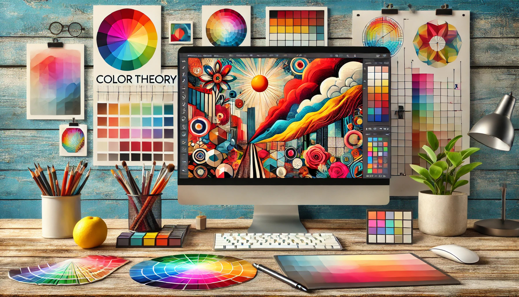
Color theory is essential for digital collage artists seeking to enhance their work. Understanding color relationships can make artwork more engaging and visually appealing. By mastering how colors interact, artists can evoke emotions and create stunning compositions that truly stand out.
In digital collage, combining different images with various colors can challenge an artist. Applying color theory helps in selecting the right hues and contrasts, allowing for more dynamic pieces. When artists know how to use the color wheel effectively, they can elevate their collages to new heights of creativity.
In a world filled with visual distractions, art must capture the viewer’s attention instantly. Color acts as a powerful tool, drawing eyes and conveying messages through artwork. By exploring the core principles of color theory, artists can ensure their collages not only pop but also communicate deeper meanings.
The Basics of Color Theory
Color theory is essential for digital collage artists. Understanding how colors interact creates vibrant and harmonious artwork. This section covers key concepts such as the color wheel, color value and intensity, and the difference between warm and cool colors.
Understanding the Color Wheel
The color wheel is a visual tool that arranges colors in a circle. It includes primary colors (red, blue, yellow), secondary colors (green, orange, purple), and tertiary colors. By exploring these relationships, artists can create color schemes that enhance their work.
Complementary colors, located opposite each other on the wheel, create strong contrasts. For example, pairing blue with orange can make elements stand out. Analogous colors, next to each other, provide harmony. Using these relationships can bring balance to a digital collage.
Color Value and Intensity
Color value refers to how light or dark a color is, while intensity measures its brightness or dullness. Understanding these concepts allows artists to create depth and focus in their artwork.
For example, lightening a color by adding white makes it a tint, while darkening it with black creates a shade. Intense colors draw attention, while muted colors can create a calmer feel. Artists can use these variations to guide viewers’ eyes within their pieces.
Warm vs Cool Colors
Warm colors include reds, oranges, and yellows, while cool colors consist of blues, greens, and purples. Warm colors evoke energy and excitement, making them ideal for drawing attention. They can also create a sense of warmth in a piece.
Cool colors, on the other hand, have a calming effect and can make a space feel larger. They work well for creating mood and atmosphere in art. Understanding when to use warm or cool colors helps artists convey emotions effectively in their digital collages.
Color Schemes for Composition
Understanding how to use color schemes can greatly enhance digital collage art. Using colors effectively can create mood and draw attention, allowing the artwork to truly come alive. Different color relationships help to establish harmony and contrast within compositions.
Complementary and Analogous Colors
Complementary colors are pairs of colors that are opposite each other on the color wheel. Using these colors together can create a striking contrast that grabs attention. For example, blue and orange or red and green can bring energy to a piece.
Analogous colors, on the other hand, sit next to each other on the color wheel. They blend well together and promote a sense of harmony. For instance, green, yellow-green, and yellow create a soothing palette. Both approaches can lead to dynamic and engaging artworks.
Triadic and Tetradic Schemes
Triadic color schemes use three colors that are evenly spaced around the color wheel. This approach offers a balanced yet vibrant appearance. For instance, combining red, blue, and yellow can provide both energy and structure in a piece.
Tetradic schemes consist of four colors arranged into two complementary pairs. This gives a rich tapestry of color options to work with. Using a tetradic scheme allows for more variety, which is great for detailed collages where different elements need attention.
Choosing a Focal Point
A focal point can greatly influence the overall composition. Colors can guide the viewer’s eyes to the most important part of the artwork. Using a bright or contrasting color for the focal area helps it stand out.
The relationship between colors is key here. If the focal point is surrounded by analogous colors, it will pop without creating chaos. In contrast, using complementary colors can create exciting tension, drawing immediate attention. This strategic use of color helps to tell a story within the piece.
Psychology of Color in Art
Color plays a crucial role in how viewers perceive and respond to a piece of art. Understanding the psychology behind color can help artists make informed choices that enhance their work. This knowledge is essential for creating emotional connections and effective visual narratives.
Emotional Responses to Color
Colors can evoke strong feelings and reactions. For instance, blues often create a sense of calm and tranquility, while reds can inspire energy and passion.
- Warm Colors: Red, orange, and yellow tend to energize and stimulate emotions. These colors may increase feelings of enthusiasm and warmth.
- Cool Colors: Blue, green, and purple can evoke peace and serenity. They help to create a soothing mood in artworks.
Artists often choose specific colors to elicit the desired emotions in their audience. Bright colors may grab attention, while softer shades can create a gentle experience.
Cultural Significance of Colors
Colors hold different meanings across various cultures. For example, white symbolizes purity in Western cultures but may represent mourning in some Eastern cultures. Understanding these differences is vital for artists working with diverse audiences.
- Red: In many cultures, red signifies love, while in others, it may represent danger or aggression.
- Green: This color often symbolizes nature and growth, but it can also indicate envy or inexperience in some contexts.
By considering cultural significance, artists can communicate more effectively and avoid unintended messages in their work. This awareness enriches their art and enhances viewer engagement.
Color and Branding in Collages
Color plays a vital role in establishing a brand identity for collage artists. It helps in creating a unique visual style that resonates with viewers. A well-thought-out color strategy can tie together various pieces, making them instantly recognizable.
Consistency Across Pieces
For an artist, maintaining color consistency is crucial. This means using the same or similar colors in different artworks to create a cohesive look. When a viewer sees a collage that uses familiar colors, they can easily connect it to the artist’s brand.
To achieve consistency, artists can create a color swatch or a reference sheet. This document lists the specific colors used in various works. Artists should stick to these colors when making new pieces.
Another tip is to consider the emotional impact of colors. For example, using soft pastels can evoke calmness, while bold colors might convey energy. Keeping this emotional context in mind helps to strengthen the artist’s brand message.
Creating a Personal Brand Palette
Building a personal brand palette is an exciting step for any collage artist. This palette should reflect their style and the emotions they want to convey. It’s essential to choose a mix of colors that complement each other well.
Artists can start by selecting main colors that represent their identity. They should also add accent colors to enhance their work. Accents can bring depth and interest, making collages pop.
It can be helpful to use color theory principles when selecting these hues. Warm and cool colors serve different purposes and can dramatically change how a piece feels. Artists should play with combinations until they find a palette that feels uniquely their own.
Mixing and Layering Colors
Mixing and layering colors play a crucial role in creating depth and vibrancy in digital collage art. Understanding how to blend colors effectively and utilize transparency can greatly enhance the visual appeal of artwork.
Digital Tools for Color Blending
Digital artists have many tools to blend colors intuitively. Programs like Adobe Photoshop and Procreate offer tools such as the brush tool, color picker, and gradient editor.
Using the brush tool, artists can experiment with various brush settings to achieve smoother transitions. The color picker helps in selecting exact hues, while gradient editors allow for beautiful, gradual color shifts.
Many artists also benefit from keeping a color mixing chart handy. This enables them to remember effective combinations and create unique tints, shades, and tones. A color chart is especially useful for identifying how light influences color.
The Impact of Opacity and Transparency
Opacity and transparency can dramatically change the look of layered colors. Adjusting opacity allows artists to control how colors blend and interact.
For example, a layer set to 50% opacity lets underlying colors show through. This creates depth and richness, making the collage more dynamic.
Transparency can also be used to create interesting effects, like soft shadows or highlights. Artists can layer colors while varying their transparency to build visual interest.
Understanding these concepts helps in crafting pieces that both resonate emotionally and captivate viewers.
Textures and Patterns
Textures and patterns can greatly enhance digital collages. They add depth and interest, allowing artists to create more engaging compositions. Learning to use these elements effectively makes a significant difference in overall design quality.
Incorporating Textures Effectively
When adding textures, the key is to choose ones that complement the main elements of the collage. Subtle textures such as fabric or paper can provide a rich background without overpowering the primary subject.
Artists should consider the size and scale of the texture in relation to other elements. A large, rough texture can be applied to the background for a dramatic effect. In contrast, smaller textures work well as overlays that blend with other visuals. Tools like blending modes in software can help integrate textures smoothly, allowing for adjustments in opacity.
Integrating Patterns Without Overwhelming
Patterns are fun ways to add character to a digital collage. However, they should be used carefully. A busy pattern can distract from the main focus. It’s important to select patterns that enhance rather than compete with the artwork.
One effective approach is to use patterns in smaller, isolated sections. For example, placing a patterned area in a corner or as a border can create balance. Artists can also adjust the color of patterns to match the collage’s overall theme. This makes the pattern feel cohesive within the artwork, while still bringing a unique touch to the piece.
Lighting and Color
Lighting plays a crucial role in how colors appear in digital collage art. Different light sources can change how colors look, impacting the mood and focus of the artwork.
Artists should consider the type of lighting when choosing colors. Here are some basic types of lighting:
- Natural Light: This sunlight creates vibrant and true-to-life colors.
- Artificial Light: This can vary widely. Cool lights give a bluish tone, while warm lights create a yellow or orange hue.
- Dramatic Lighting: Strong contrasts can highlight certain colors while casting others in shadow.
Understanding how light interacts with color helps artists create depth and interest. For example, soft shadows can make colors blend smoothly, while hard edges can make them pop.
Color temperature is also important. It can be helpful to think of colors as warm (red, yellow) or cool (blue, green). Warm colors tend to attract attention, while cool colors can create calmness.
When creating a digital collage, she might experiment with blending modes and opacity. Using layers effectively allows for better control of how light and color interact, leading to stunning results.
Using contrast effectively can draw the viewer’s eye. High contrast areas stand out, while low contrast creates more subtle transitions.
Advanced Techniques
In digital collage, using advanced color techniques can significantly improve the visual impact. Artists can create depth and mood by exploring gradients, color interactions, and different filters. These methods allow for endless creativity and expression.
Playing with Gradients
Gradients add dimension and movement to digital collages. By blending colors smoothly, artists can guide the viewer’s eye and create a focal point. Different types of gradients can be used, such as linear, radial, or angular, depending on the desired effect.
To create a gradient:
- Choose a color palette: Select colors that complement each other.
- Apply the gradient tool: Most software offers a gradient tool for easy application.
- Adjust opacity and blending modes: This will enhance the gradient’s effect and integrate it better with other elements.
Gradients can evoke emotions, making them a powerful tool in digital artwork.
Color Interactions and Illusions
Understanding how colors interact is key for making compelling digital collages. Complementary colors, for example, can create vibrancy and contrast. Using analogous colors can produce harmony and a cohesive feel.
Artists can also play with color illusions, such as:
- Simultaneous contrast: Colors appear different depending on their surroundings.
- Optical mixing: Using tiny dots of color that blend from a distance to create a new hue.
These techniques can transform a simple piece into something eye-catching and thought-provoking.
Using Filters to Enhance Colors
Filters can dramatically change the appearance of colors in digital collages. They allow artists to create mood and atmosphere without manually adjusting each element.
Common filters include:
- Brightness/Contrast: Adjust these settings to make colors pop or to soften the overall image.
- Hue/Saturation: Change the color tones and intensities for a more striking effect.
- Color Lookup: Use preset color grades to give artwork a unique flair.
Filters are quick tools for enhancing colors and can lead to unexpected and delightful results.
Inspiration and Creativity
Finding inspiration is essential for digital collage artists. It helps them create unique artwork that stands out. Creativity can come from studying other artists and through personal experimentation.
Studying the Masters
Exploring the work of established artists can ignite new ideas. By studying famous digital collage artists, one can learn about color use, composition, and techniques. Analyzing how they blend colors and shapes can inspire one’s own work.
Important points to consider:
- Observe color palettes used in various pieces.
- Note how the arrangement of elements affects mood and message.
- Identify techniques that resonate personally.
Artists can even create mood boards inspired by their favorites. This practice helps track ideas and themes, making it easier to explore one’s style.
Experimentation and Play
Experimentation is a fantastic way to spark creativity. Trying out new tools and techniques allows artists to discover what resonates with them. Mixing colors in unexpected ways can produce exciting results.
Suggestions for experimentation:
- Use different blending modes to see how they alter colors.
- Combine digital tools with traditional media like collage or paint.
- Set aside time for playful creation without pressure.
By fostering a playful mindset, artists free themselves from self-doubt. This approach can lead to surprising breakthroughs, enriching their artistic journey. Embracing the process enhances creativity and boosts confidence in their own unique style.
Color Management
Color management is crucial for digital collage artists. It ensures that colors look vivid and consistent across different devices and formats. This section will explore how to properly calibrate digital colors and prepare artwork for printing.
Digital Color Calibration
To achieve true-to-life colors, artists need to calibrate their monitors. This process involves adjusting the display settings to match industry standards. They can use tools like colorimeters, which measure and adjust the colors on the screen for accuracy.
Key steps in digital calibration include:
- Choose a Calibrated Environment: Work in a room with controlled lighting. Avoid glare and reflections.
- Use Calibration Software: Many tools are available to guide the calibration process. These help set brightness, contrast, and color levels.
- Regularly Recalibrate: Monitors can drift over time, so recalibrating every few months is beneficial.
Proper calibration helps artists see the true colors in their artwork, making it easier to create stunning collages.
Proofing for Print
Proofing is essential when preparing digital artwork for print. It helps ensure that the printed result matches what was seen on the screen. Artists usually create proofs to check color accuracy and overall layout before the final print.
Here are some important proofing steps:
- Soft Proofing: Use software to simulate how colors will look in print. This gives a good idea of the final outcome.
- Hard Proofing: Print a sample using the printer that will be used for the final product. This is the best way to check color accuracy.
- Understand Color Profiles: Use the correct ICC profiles for the printer and paper type. This enhances color fidelity during printing.